Design Systems that scale
Client
IWC, Porsche, Riese&Müller, AstraZeneca
Year
2024-2026
Role
UX/UI , Accessibility, Content Modelling
Summary
Building and scaling a design system requires more than just a component library; it requires a strategy that evolves alongside the product. Having built and managed systems for AstraZeneca, IWC, Porsche, and Riese & Müller, I have learned to balance design consistency with operational efficiency. In this overview, I walk through my framework for building sustainable systems, integrating token-based architecture, atomic component libraries, accessibility compliance, and structured content modeling.
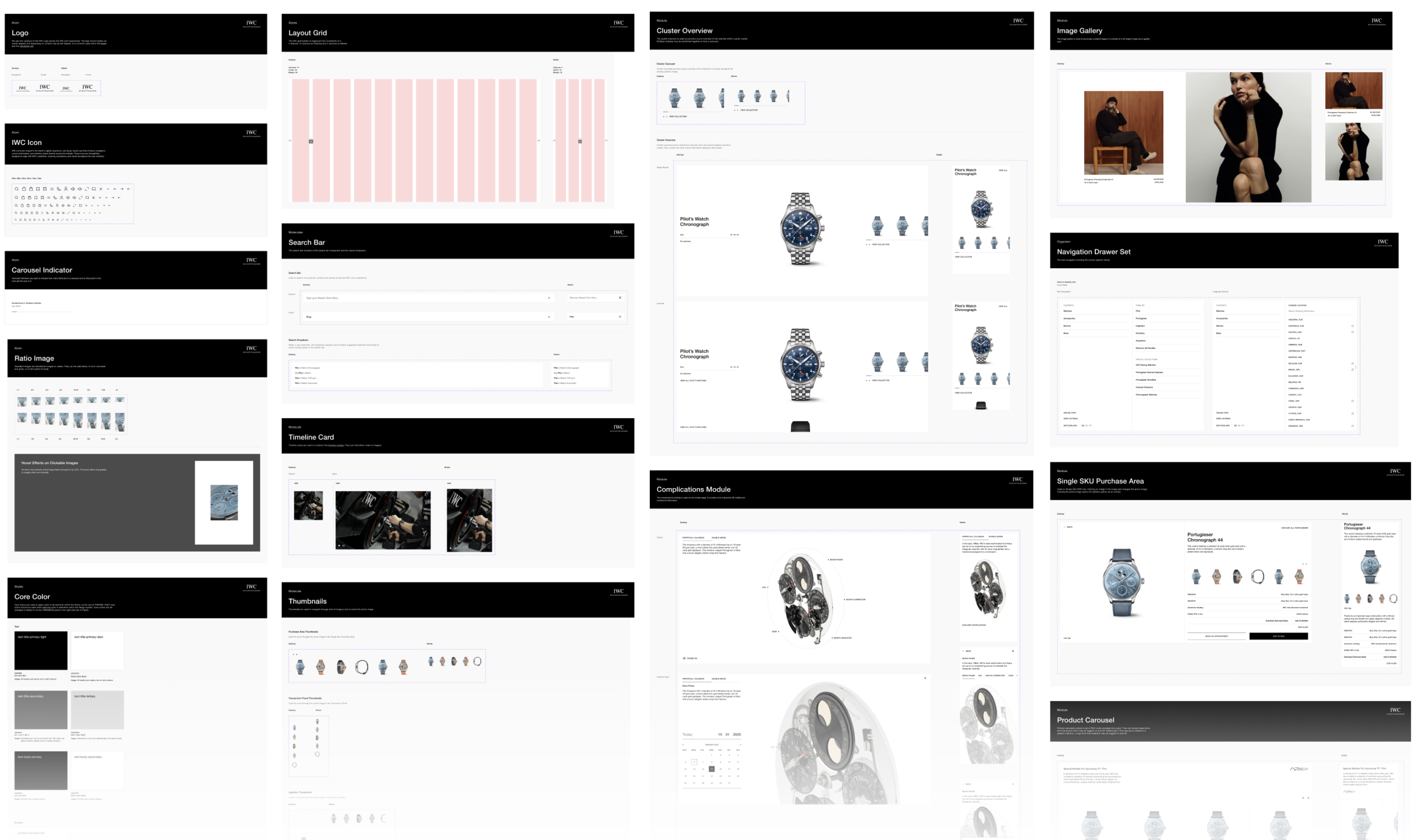
Building a design system across IWC's luxury watch platform and Riese & Müller's e-bike ecosystem taught me the same lesson twice, in very different contexts: consistency isn't the hard part — sustaining it while the product keeps moving is. This is my framework for building systems that flex instead of fracture, drawn from what actually happened on both.
How the story goes
1.Free exploration first. Before anything gets systemized, I give myself room for open-ended UI concepting: trying out different visual directions without worrying about scalability or reuse. This stage is about finding the right creative direction for the product, not about structure. Locking into components too early risks systemizing a direction that hasn't actually been validated yet.
2. Once a direction feels right, I move into a more atomic way of working, breaking the interface down into components and modules, starting with the highest-leverage, most-repeated elements first. I use atomic design as a mental model here, not a rulebook: atoms, molecules, and organisms are a useful way to think about composition, but in real products the boundaries get messy fast, so I don't force every piece into a rigid tier.
3. Check in, and consolidate. Every so often, as the library grows, I stop and audit: are any components or modules quietly doing the same job? It's easy for near-duplicate components to creep in as different features get built under time pressure. When I find overlap, I don't just delete the newer one; I look at what use case pushed someone to create it in the first place, and fold that need back into the original component so it can serve every use case that comes up. This keeps the library lean without losing the edge cases that prompted the duplication.
The vocabulary underneath everything
Every system I've built — IWC and Riese & Müller included — starts with tokens, not components. The naming decision matters most: a token like blue-500 describes what a value is; color-action-primary describes what it's for. On Riese & Müller specifically [the video attached shows this], that semantic layer meant brand or theme shifts absorbed into the token layer without touching a single component. I use a three-tier structure (primitive, semantic, component) so global changes happen at the root while individual components can still diverge when there's a real reason to.
Continuosly doubting accessibility
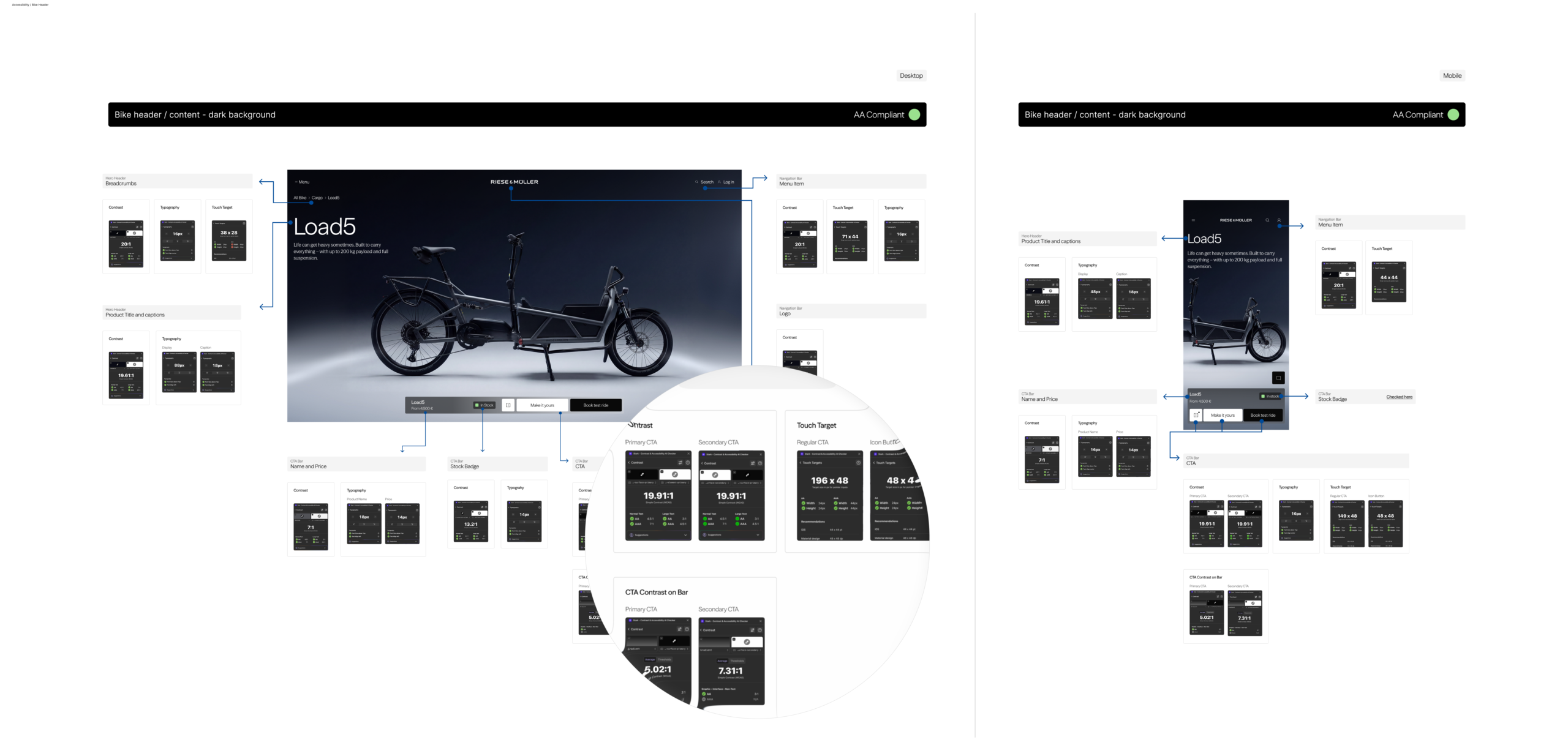
Both IWC and Riese & Müller required WCAG compliance, but the every product stresses accessibility differently — e.g. Riese & Müller's dense product imagery vs. IWC´s strap finder configurator logic.
I advocate for a 'shift-left' approach to accessibility: it is most effective when addressed at the earliest stages of design. By establishing robust interaction patterns and logical content hierarchies during the wireframing phase, I build a strong foundation that ensures every UI component is WCAG compliant, intuitive, and accessible by default.
Content Modelling - where design meets data
I've found the biggest friction point is usually a mismatch in assumptions: design imagines a component as flexible and free-form, while engineering needs a fixed schema to render from a CMS or API. Left unresolved, this produces components that look right in Figma but break the moment real content is dropped in.
Content it's foundational, and the earlier it happens in a project, the fewer painful retrofits happen later.
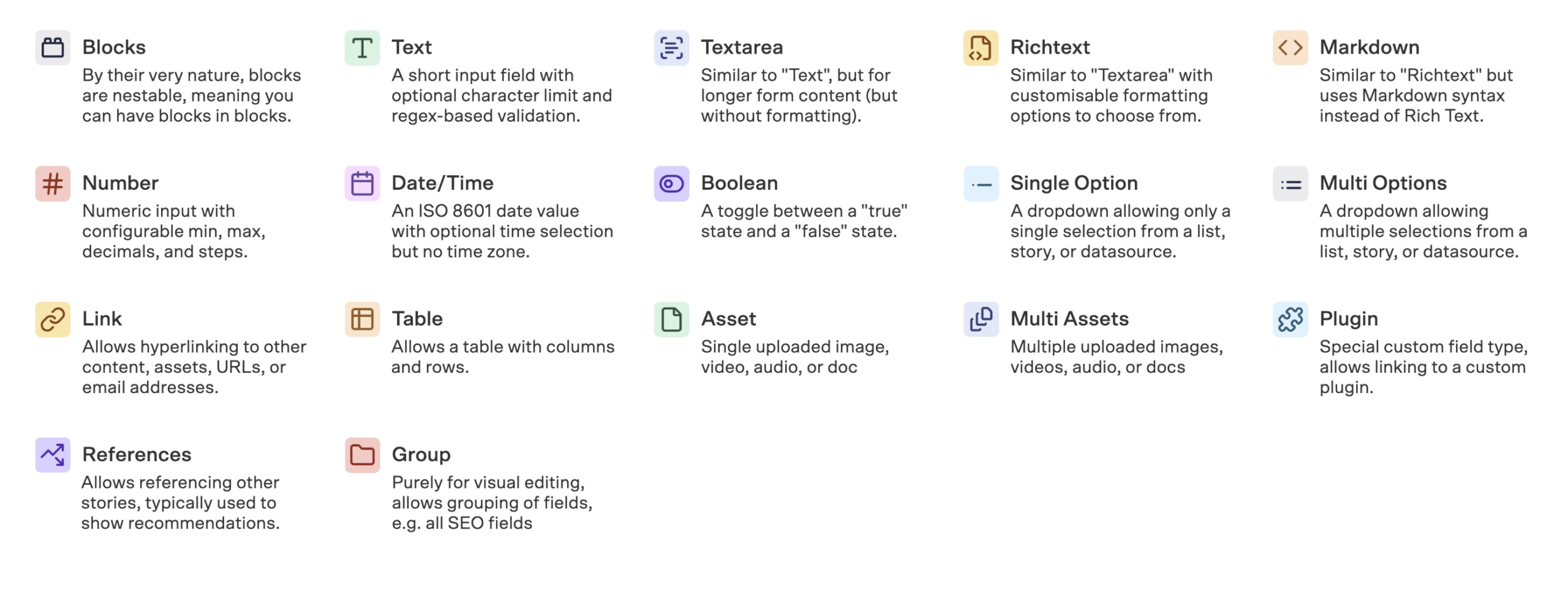
On Riese & Müller, this showed up concretely: a Product Card built in Figma had to map exactly onto a Storyblok content type, or it would look right in the design file and break the moment real bike specs and pricing were dropped in. I ran workshops with the dev team to build a shared content model — every field, mapped against every context the card would appear in — so the Figma component's variants and the CMS content type were designed from the same source, not handed off separately.
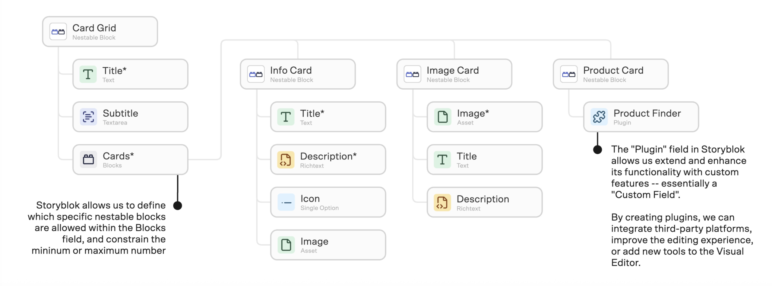
Example of content modelling of a Product Card to be build on Storyblok
The bottom line
If I were to summarize how I think around libraries: a design system isn't a file, it's a living being: built not to be finished, but to be endlessly sustained and evolved.
LinkedIn /martinagalofaro
Copyright 2026©